Data Elements
Workspace contains multiple data elements where each element type provides unique possibilities to visualise the data.
Each chart has some editable parameters where the edit window can be opened with charts top right corners edit button ![]() .
.
Line chart
Line chart is the most basic chart type that visualizes logged data points in a time in x-axis against logged channels in y-axis.
For example here speed motor channel is shown in line chart against time in x-axis.
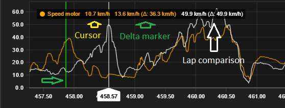
Chart legend shows channels value from cursors y-position.
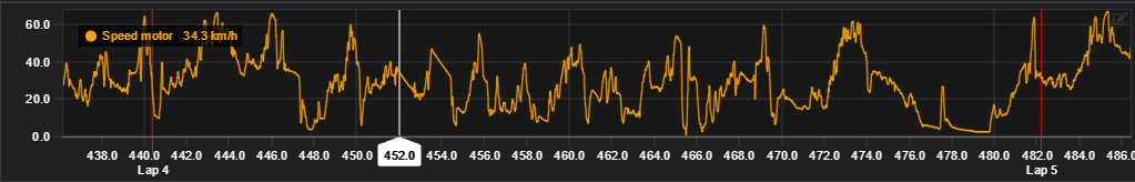
Chart settings
| Setting | Description |
|---|---|
| Y-axis charts | Add or remove y-axis charts from single x-axis. |
| Channels | Shown channels for each y-axis chart. Single or multiple. |
| Y-axis range min/max | Define custom y-axis range. Leave empty for default values. |
Legend comparison
Legend show two channel values for comparison: cursors value and delta markers value and their difference.
Lap comparison is not available in Analyzer Free.
Multiple channels
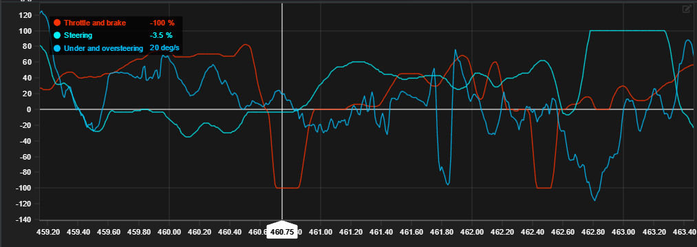
Line chart allows multiple channels to be shown in same axis. This is useful for comparing multiple channels against each other in the same x-axis.
2D scatter chart
2D-scatter has two channels and visualizes them in a XY-scatter plot.
Data visualization requires both axis channels to be set
Image shows acceleration-Y and X comparison.
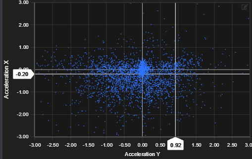
Visualized XY-point count is determined by the viewports zoom length. Smaller the zoom range, fewer dots are shown and vice versa.
Chart settings
| Setting | Description |
|---|---|
| X-axis channel | Singe channel for x-axis |
| X-axis min/max range | Min/max range for x-axis |
| Y-axis channel | Single channel for y-axis |
| Y-axis min/max range | Min/max range for y-axis |
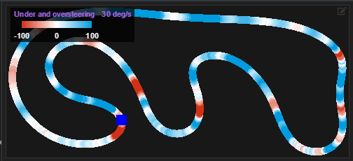
Track chart
Generated track layout is displayed on the track chart module. Different data channels can be visualized in the track chart based on configurable settings.
Track chart visualizes base laps channel values and different channel values are indicated with rolling colour values base on the legends colour bar.
See also Track map page about track map generation.
Chart settings
| Setting | Description |
|---|---|
| Channel | Shown data channel |
| Minimum value | Minimum value to display |
| Maximum value | Maximum value to display |
| Minimum value colour | Colour to define minimum value |
| Maximum value colour | Colour to define maximum value |
| Colour transition type | Legend colour indicators type |
Split analysis chart
Split analysis chart shows calculated time splits for each lap and its splits.
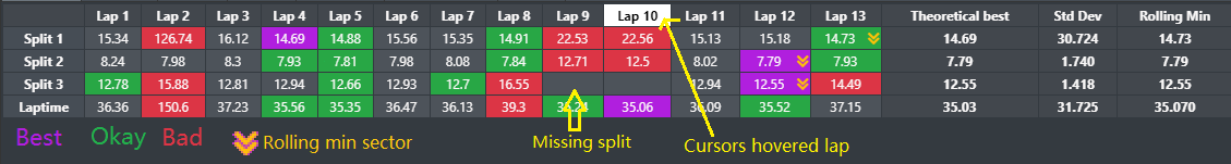
Note missing split markers on laps 9 and 10. In Analyzer Free you can't modify lap time.
Calculated values
| Value | Description |
|---|---|
| Theoretical best | Sum best splits to calculate theoretical best value for each split and combined theoretical lap |
| Standard deviation | How much splits and combined lap differs from combined mean value |
| Rolling min | Minimum sectors from each split combined to visualize best possible lap |
Chart settings
Split analysis does not have any configurable settings.