Workspace can be modified with different elements and each element type provides unique possibilities to visualise the data.
Line
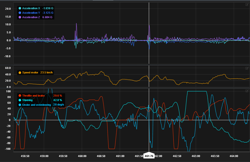
Line chart is the most basic chart type that visualizes logged data points in a time/distance in x-axis against logged channels in y-axis.
For example here speed motor channel is shown in line chart against time in x-axis.
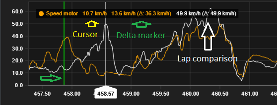
Chart legend shows channels value from cursors y-position.
Legend can be moved by dragging it. Double click to reset its position.
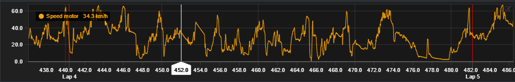
Line chart is required in each workspace tab for moving the cursor.
Chart settings
|
Setting |
Description |
|---|---|
|
Y-axis charts |
Add or remove y-axis charts from single x-axis. |
|
Channels |
Shown channels for each y-axis chart. Single or multiple. |
|
Y-axis range min/max |
Define custom y-axis range. Leave empty for default values. |
|
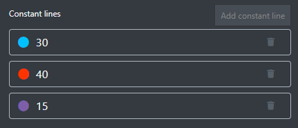
Constant lines |
Constant line markers to help analysis. |
Legend comparison
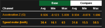
Legend shows three channel values for comparison: cursors value, delta markers value and difference and compared laps value and difference to base lap.
Multiple channels
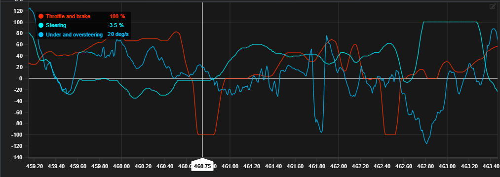
Line chart allows multiple channels to be shown in same axis. This is useful for comparing multiple channels against each other in the same x-axis.
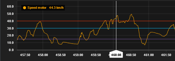
Multiple y-axis
From the edit modal you can add additional y-axis charts to single x-axis. Additional y-axis charts can be resized horizontally from the divider.
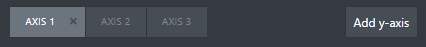
Axis can be rearranged by dragging them in the edit modal.
Image shows three different y-axis charts in the same x-axis. Speed motor chart has been resized for easier inspection.
Constant lines
Line chart has option to add constant marker lines. Colour can be changed by clicking the colour dot.
2D Scatter
2D-scatter has two channels and visualizes them in a XY-scatter plot.
Data visualization requires both axis channels to be set
Image shows acceleration-Y and X comparison.
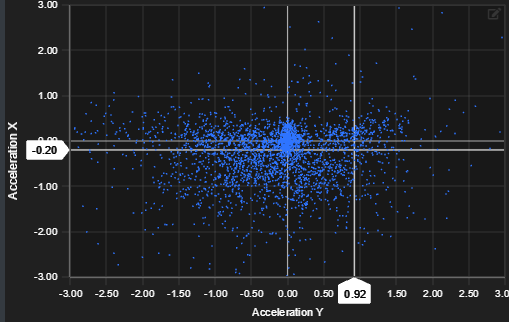
Visualized XY-point count is determined by the viewports zoom length. Smaller the zoom range, fewer dots are shown and vice versa.
Compared lap is overlaid on top of base laps plot with white colour.
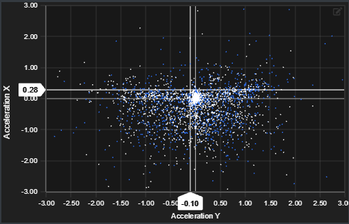
Chart settings
|
Setting |
Description |
|---|---|
|
X-axis channel |
Singe channel for x-axis |
|
X-axis min/max range |
Min/max range for x-axis |
|
Y-axis channel |
Single channel for y-axis |
|
Y-axis min/max range |
Min/max range for y-axis |
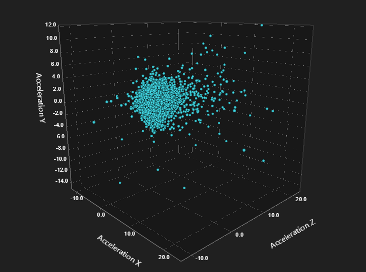
3D Scatter
3D scatter chart
3D scatter chart is similar to 2D scatter except one added axis. Chart can be rotated with mouse. Plot dot count is shown also based on viewed zoom range.
Data visualization requires all all three axis channels to be set
Comparison is shown with white dots.
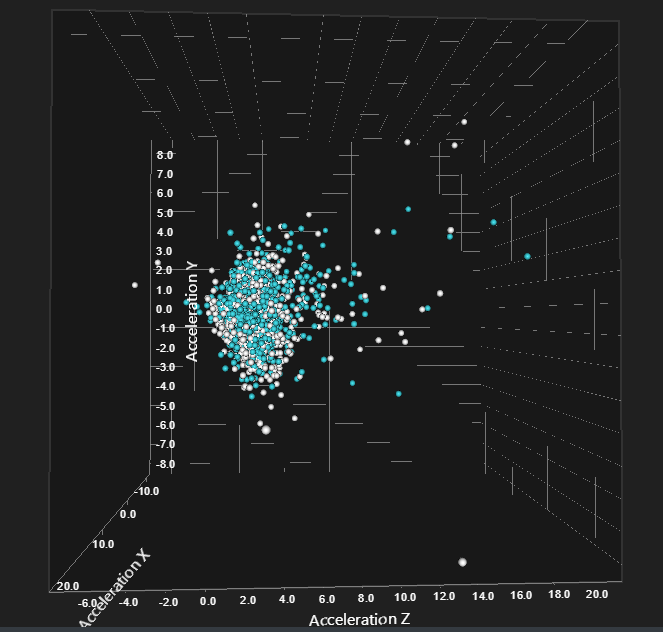
Chart settings
|
Setting |
Description |
|---|---|
|
X-axis channel |
Singe channel for x-axis |
|
X-axis min/max range |
Min/max range for x-axis |
|
Y-axis channel |
Single channel for y-axis |
|
Y-axis min/max range |
Min/max range for z-axis |
|
Z-axis channel |
Single channel for z-axis |
|
Z-axis min/max range |
Min/max range for z-axis |
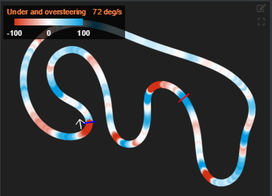
Track Map
Generated track layout is displayed on the track chart module. Different data channels can be visualized in the track chart based on configurable settings.
Track chart visualizes base laps channel values and different channel values are indicated with rolling colour values base on the legends colour bar.
Legend can be moved by dragging it. Double click to reset its position.
Track path can be hovered with mouse to view data more closely.
Track map is generated with the Track map generator found in the header toolbar.
Chart settings
|
Setting |
Description |
|---|---|
|
Channel |
Shown data channel |
|
Minimum value |
Minimum value to display |
|
Maximum value |
Maximum value to display |
|
Minimum value colour |
Colour to define minimum value |
|
Maximum value colour |
Colour to define maximum value |
|
Colour transition type |
Legend colour indicators type |
Split Analysis
Split analysis chart shows calculated time splits for each lap and its splits.
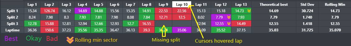
Note missing split markers on laps 9 and 10. See Modify lap times to add missing splits manually.
Calculated values
|
Value |
Description |
|---|---|
|
Theoretical best |
Sum best splits to calculate theoretical best value for each split and combined theoretical lap |
|
Standard deviation |
How much splits and combined lap differs from combined mean value |
|
Rolling min |
Minimum sectors from each split combined to visualize best possible lap |
Chart settings
|
Setting |
Description |
|---|---|
|
Alignment |
Define split matrix direction to be vertical or horizontal |
|
Height |
Whether chart takes all available space or stays minimized |
Time Difference
Time difference chart visualizes compared laps time difference agains base laps lap time.
Compared lap must be selected for data to be shown.
Negative values mean that base lap is slower than compared value and vice versa.
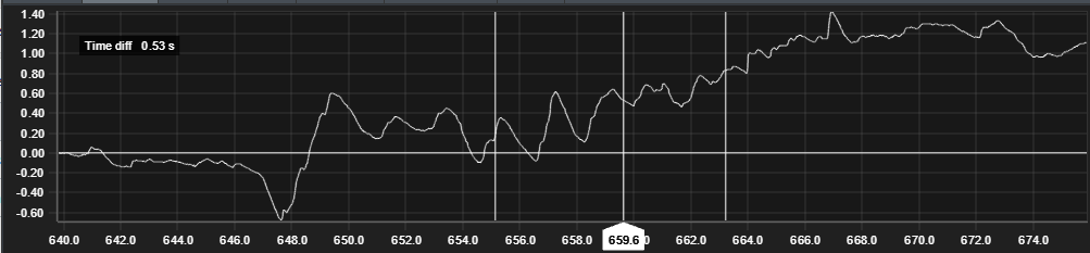
Chart settings
Element doesn't currently have any customizable settings.
Density
Density chart compares channels values in x-axis to percentage value of the cursors data range.
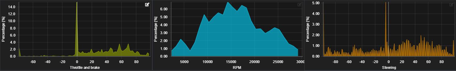
Comparison is laid over base data with white outline.
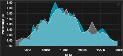
Chart settings
|
Setting |
Description |
|---|---|
|
Channel |
Single channel for x-axis |
|
Bin width |
Data sampling size |
Gauge
Gauge chart visualizes channels values in simple gauge. Useful for visualizing steering position or throttle and brake state.
Comparison is yet to be implemented on gauge chart.
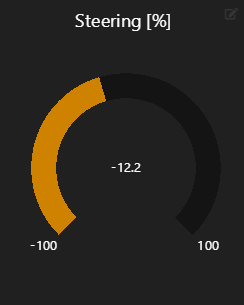
Chart settings
|
Setting |
Description |
|---|---|
|
Channel |
Single channel for gauge |
|
Range min |
Define range min |
|
Range max |
Define range max |
Bar
Bar chart visualizes channels values in simple bar format. Comparison is shown with separate white bar.
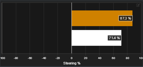
Chart settings
|
Setting |
Description |
|---|---|
|
Channel |
Single channel for x-axis |
|
Range min |
Define range min |
|
Range max |
Define range max |
Video
Video element gives possibility to show video along the data in same view. Not only it is possible to show the video but also possible to link video to data, so that you easily go through the data and to show according location in video.
Shown video for each data file is imported and configured in the Video importer window.
Video selection is working globally, so if you have multiple video elements in the workspace, the same video per data file is used in all elements
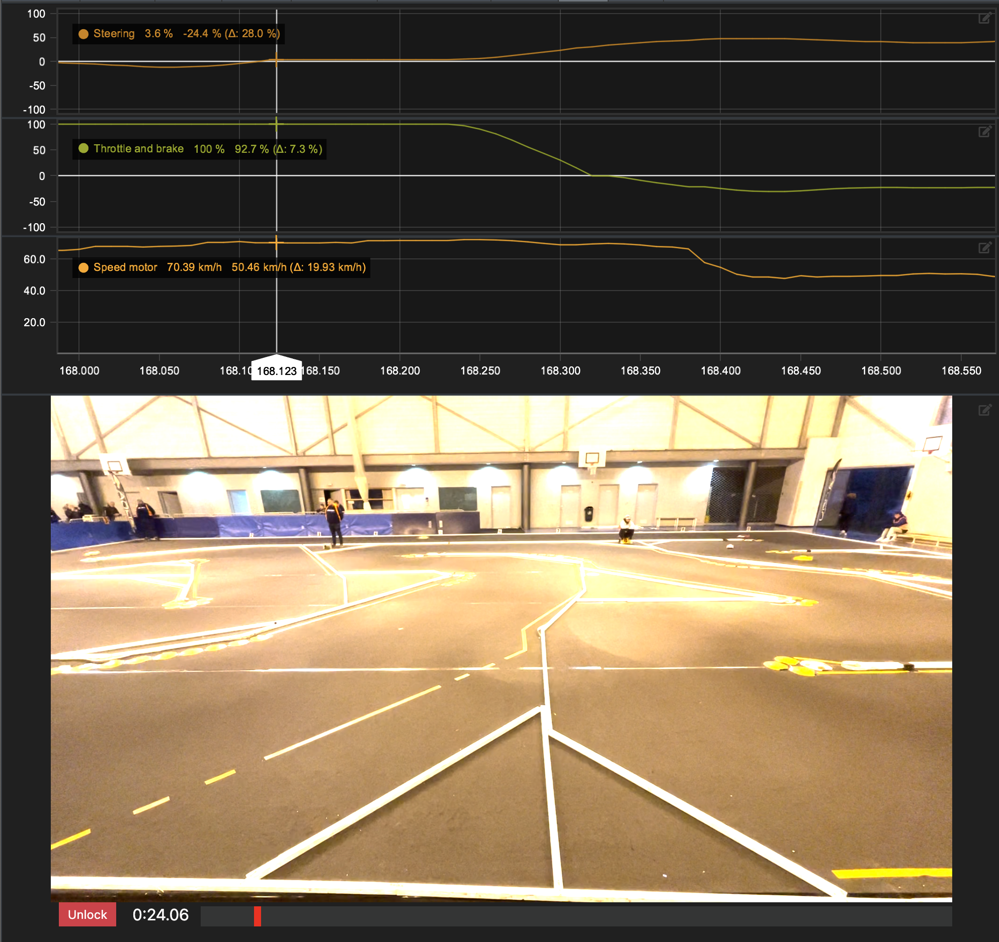
Chart settings
Element doesn't currently have any customizable settings.
Channel Value
Element shows channel name, value, unit and cursor history.
Cursor history is NOT showing data as function of time, but only works as history for previous cursor values.
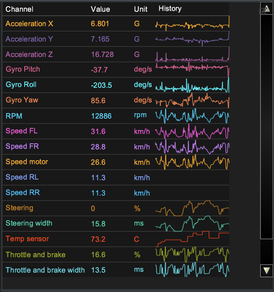
Chart settings
Element doesn't have any specific settings and only channels can be selected. In edit window user can select or unselect whole channel group from table heading.
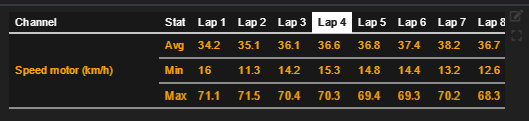
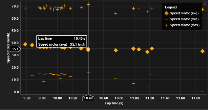
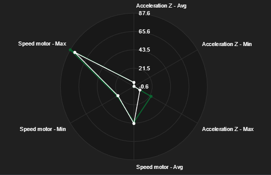
Run Statistics
Run statistics chart is used to compile various statistics from single run to one table or chart.
Statistics can be calculated from visible data range or per lap. Per lap is typically used when it's required to see trends over single run and visible range is useful when you want to dynamically change the calculation range.
Data can be presented either in table format or as a chart.
Visualization types
|
Range |
Visualization |
|---|---|
|
Per lap |
Table Value vs laptime chart |
|
Visible range |
Table Radar
|
Channel calculation parameters
|
Parameter |
Description |
|---|---|
|
Avg |
Range average |
|
Min |
Range minimum value |
|
Max |
Range maximum value |
|
Abs Max |
Range maximum absolute value |
|
Sum |
Range value intergral |
|
Std Dev |
Range standard deviation |
|
Delta |
Difference between range start and end |
|
Start |
Range start value |
|
Finish |
Range end value |